Technical analysis
The trend is your friend
This old stock market rule also applies in electronic trading . So in a rising market, the probability that the upside breakout ( a breakout is when a course level, for example the high of the previous bar is broken ) achives a profit with a long position is much higher than oppening a short orders at the same price level. The steeper the climb , the more likely is realizing a profit on the purchase of the value. The best is trading with the trend. However, there are always trader who trades against the trend.
Bullish & Bearish
If the chart's price is moving in one direction, it is called a trend . If the price goes up it is called an uptrend or bullish. In the case of a shoot down ( a downtrend ) it is called bearish . You can easily remember where the Bear wants to push the market from the top with his big paws and under the Bull wants to shoot the course with his horns in the height.
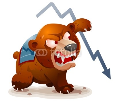
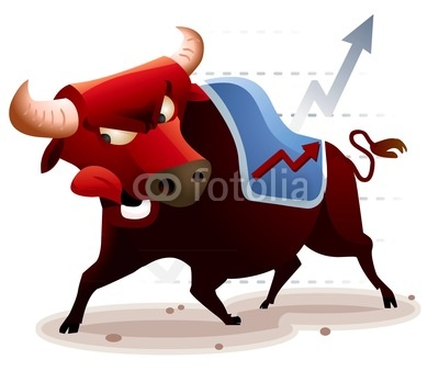
Chart - The Basics
The primary tool of the trader is the chart . A chart is doing nothing but the graphical representation of the price performance of a particular Stock market value . Three major types of charts can be distinguished and used today. Each has its specific advantages and disadvantages.
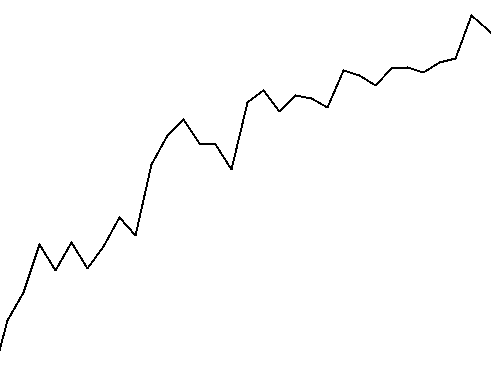
Line Chart
The simplest form is the line chart . Here the courses are connected by a single line , point by point . However, this one-dimensional representation is more suitable to visualize the general trend of price performance , for specific trading decisions provides the line chart too little information.
Bar Chart
To enhance the representation of the price development , the bar chart is employed. This chart shows, in the form of bar a much more accurate picture of the price development . In this case, a bar is displayed for each period. Looking at the individual beams it can be seen at what price , the bar was opened ( opeing price). This was the first course of this time period ( eg 15 minutes). Similarly, shows the Close ( closing price) the last price of this period. The top represents the highest and the lowest price , the lower end of this period. Bar charts therefore show the trader next to the current price also the history. Extra long or short bars refer to specific market situations. If a bar particularly short , was very likely traded little in this period ( typical of the asian session ) . If a bar is very long , it indicates that the messages that have moved many dealers for embarking or disembarking. Long bars can also arise when automated trading systems on technical (statistical ) response signals and open positions.
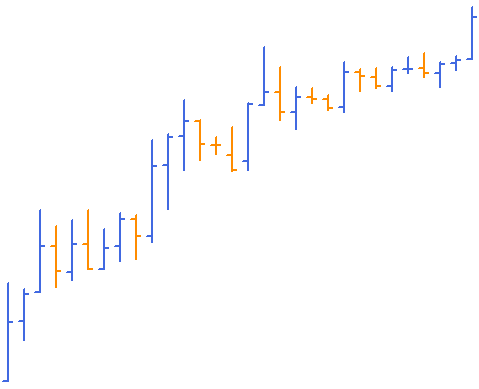
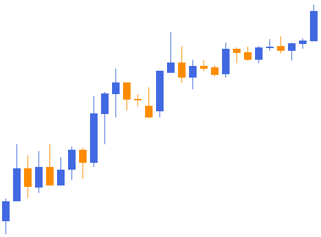
Candlestick
A special form of bar charts is the so-called candlestick chart or japanese candlesticks . Technically, this is just the period history. It is chosen just another form of representation. Many traders prefer Candlesticks as they act special graphic formations that can be seen better in this chart . Bars also show very well the direction of a market. In the top chart , the "bull bars " were highlighted in blue. A blue bar indicates that the closing price was higher than the opening price , so in this period, the market has moved up. It is typical that in a rising market more blue bull bars and in a falling market bears more orange bars ( closing price is lower than the opening ) are to be seen . Of course, this is not a correct indicator of a trend , but there is an indication that a trend may exist . Loses the trend its driving force , it often happens that the bars move in rapid succession. This is often a sign that the trend has come to an end , or a short consolidation ie recovery phase of the courses follows. Especially for inexperienced traders consolidations are very hard to master with success. These should then be sure to stay away from this value , or close positions received.
Help Tradarz.com to grow
If you liked this article please go to the top and share it with your friends by pressing on Like, Share, Subscribe and Follow.